Mobile-friendly site copy

Last month, Google issued an ultimatum to webmasters the world over: make your websites mobile-friendly before April 21, 2015, or we'll stop showing you in our mobile search results. You can read the official announcement on Google's blog; search experts have nicknamed the promised algorithm change "the mobile SEO-pocalypse", and with that mid-April deadline now less than a month away, innumerable business owners are scrambling to make their sites look good on smaller screens so as to avoid losing their Google traffic.

Now, we're not here today to give you responsive design hints - the internet is already packed with articles explaining how to make your website 'mobile-friendly', and if you want our help, you can request a quotation here. However, we have noticed one potential issue that few others seem to pick up on, and it concerns your website's text.

You see, when web designers create a new design for an old website, they will often just copy and paste the old site's copy into the new design. This approach can create some problems for the end user, even if the information within the text is up-to-date. Here's a fictional example:

  • Alice is an interior designer who owns her own business. She has a brochure website - let's call it aliceinteriors.com - that she uses to drive enquiries. Would-be customers fill in a contact form on the website, and Alice calls them up to discuss their requirements, quote prices, and so forth.

  • Alice has heard about Google's upcoming algorithm change, and she wants to make her website mobile-friendly before April 21 to make sure she doesn't lose any business. She hires a local web design company to create a new responsive design and optimise the site for mobile users.

  • A responsive website is effectively several different website designs in one, and aliceinteriors.com will now look different depending on whether Alice views it on a PC or on a smartphone. For instance, the site menu will likely be represented by the ubiquitous hamburger icon on smaller screens, and certain elements of each page may appear in different positions across different devices.

  • While looking at the mobile version of her website, Alice notices an issue: the text on her homepage tells users to "Fill in the form on the right", but in the mobile view, Alice's all-important enquiry form is placed directly below the text in question.

This imagined scenario is just one example. Broadly speaking, any written reference to site layout ("Click on the link below", "Select an option from the menu above", etc.) becomes problematic - if not outright misleading - when placed within a responsive design. Unless you and your web designer can find a way to ensure that certain items remain static across all views, it may be better to remove any such phrases entirely and find other ways to draw attention to your website's key elements.

Either way, there's an important lesson to be learned here: when optimising your website for mobile users, be sure to read through your site's text in each different view to make sure that you aren't confusing people with smartphones!

Port Painters website preview

Port Painters aren't your average painting and decorating company. They are a team of industrial painting contractors, which means that they provide protective coatings for huge structures like stadiums and chemical plants. You may be familiar with some of their work - their previous projects include Liberty Stadium, Cardiff City Stadium, and the Cardiff Bay Barrage, among other major South Welsh landmarks.

An impressive resumé like that deserves to be shown off, and that's why Port Painters came to us. The company's previous website was old-fashioned and plain-looking; we were asked to update it, to give Port Painters a new online representation that would present them as a dynamic, modern company (albeit one with four decades of experience!)

The new Port Painters website went live today, and we hope that the company are as happy with it as we are. The outdated grey design has been replaced by a more vibrant blue-and-white colour scheme, and the new site's layout is far easier to navigate than before. Overall, the new site is simply a far better advertisement for Port Painters; for example, their high-profile previous projects were represented by plain text on the old site, but the new 'Portfolio' page uses hi-res photographs of the Liberty Stadium et al to really drive home the company's outstanding credentials.

Visit www.portpainters.com now to take a look at this new brochure site and experience our latest work for yourself.

Safety Lifting website

Safety-Lifting.com is a brand new ecommerce website with a wide range of products on offer, including safety equipment, material handling gear, and heavy-duty lifting equipment. The site, which went live earlier this week, is specifically targeted at trade customers (e.g. agents and distributors who will re-sell the goods to their own customers), and so it does differ from the average ecommerce site in several key ways:

  • Site users must register for a trade account before placing any orders; the checkout page cannot be accessed unless you are logged in
  • Safety Lifting's trade prices are only shown to registered trade users
  • The website's design and copy were created with professional traders - rather than retail consumers - in mind

Of course, in spite of these differences, the Safety Lifting site still needed to be as functional and as user-friendly as any other website. Mobile users will notice that the site has a responsive design, allowing it to adapt to any screen size without sacrificing the usability; furthermore, we have made the account signup process as streamlined and as straightforward as possible, making it easy for a busy trader to create their account and complete their purchase without any trouble.

Click here to visit the Safety Lifting website and see our latest work.

Google+ is a bit of a laughing stock in some circles. Launched in the summer of 2011, Google wanted G+ to be the social network that made Facebook, Twitter, and the other social giants sweat; three and a half years later, Google+ still has a long way to go before it catches up to Mark Zuckerberg and his big blue empire. At time of writing, 890 million people use Facebook on a daily basis, while Wikipedia puts Google+'s total user base at 540 million people - a solid 350,000,000 fewer than Facebook.

But does this mean that Google+ is a failure? You'd be forgiven for thinking so - most of us still use Facebook, not G+, to stay in touch with our friends, and even Google themselves tend to avoid talking about their social baby much these days. Having said that, there are plenty of good reasons to give Google+  a try...

Communities

Google+ is great if you want to find people with the same interests as you. There are hundreds of thousands of Google+ communities, and if you can't find one for your favourite thing, it's pretty easy to create your own and invite people to join it. G+ Communities are similar to Facebook Groups, but generally speaking, communities are far more active and far easier to find, join and use.

Auto-hashtags

You've probably used hashtags on Twitter, but Google+ goes a step further than its laconic competitor by automatically adding relevant hashtags to your posts. Here's an example from our own G+ account:
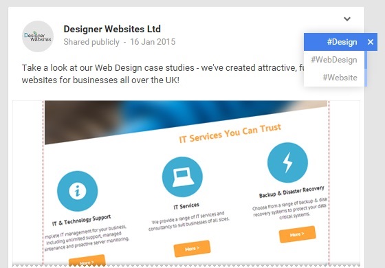
Google+ post

Notice how the post itself doesn't contain any hashtags whatsoever. Instead, Google+ looked at the content of our post and decided that #Design#WebDesign and #Website would be suitable tags for it. This improves your content's chances of being seen by targeting trends that you may not even have known about; this feature is particularly useful if you are posting topical content about current news stories, which people may well be following using specific hashtags that you don't know about.

SEO

If you're a website owner and you're wondering how social media might help you to climb the search rankings, you absolutely need to take a look at Google+. Remember, this is Google's own social network, and any shares or +1s you receive are effectively a recommendation to the search engine itself. Here's an interesting quote from G+'s Wikipedia entry:

According to Business Insider and TastyPlacement, having "Google+ followers boosts the [Google search] ranking the most, while a "+1" still does way more for your search ranking than Facebook or Twitter."

If you use YouTube, Gmail, Blogger, Google My Business, or any of Google's other services, you probably already have a Google+ account. You may not have used it yet, but it's never too late to log in and give it a try. It may yet overtake Facebook one day...

SunSpaces website


If you'd like to add a little something extra to your garden, our latest project may well be of interest to you. We recently completed a brand new website for SunSpaces, an up-and-coming outdoor business specialising in stylish glass verandas and gorgeous garden rooms.

SunSpaces' unique selling point is their ability to provide something completely bespoke. There are several UK companies who provide sunrooms similar to those sold by the SunSpaces team, but not only do SunSpaces use better materials than most of their competitors, they are also far more flexible, offering a colossal range of options and aiming to provide a living space that's tailored to each individual customer.

The new SunSpaces site is completely responsive, allowing potential customers to research the company's garden rooms on the go and find out a little bit more when they get home. The website's purpose is to drive enquiries for the business; to get people on the phone so that the SunSpaces team can discuss the customer's options and explain in detail just what the company can do. To assist with this goal, we made sure that the company's contact details were clearly displayed at the top of each page, and that all of the content was carefully geared towards sparking those all-important enquiries.

To see the SunSpaces website for yourself - and to find out more about adding a garden room to your property - visit www.sunspaces.co.uk now.