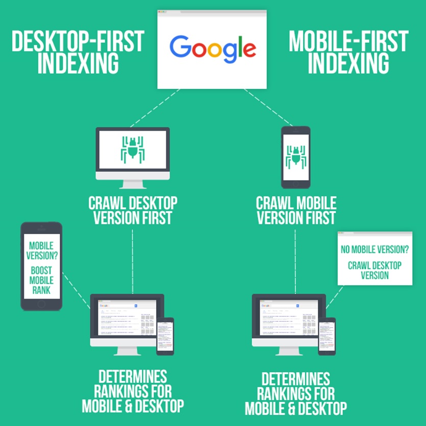
In March 2018, Google announced that they were starting to migrate their crawling method over to mobile-first indexing. What this means is that Google is beginning to use mobile versions of websites for indexing and ranking, where previously they prioritised the desktop version of a site.
(Note that Google have said that they will continue to have a single index that serves all Google search results; therefore, they won't be implementing a separate 'mobile-first' index.)
The switch to mobile-first indexing represents a reversal in the way Google approaches website content. A majority of web traffic now comes from mobile devices, and it's encouraging to see Google responding to this shift and striving to make everyone's browsing experience as enjoyable as possible.
How will mobile-first indexing affect my website?
Google's announcement indicated that websites won't be removed from the index just because they are not mobile friendly. However, Google will generally prioritise mobile-friendly websites in their results if the user is searching on a mobile device. We anticipate that desktop-only sites will lose organic search traffic as more and more Internet users shift away from PCs and towards smartphones.
If you have a responsive website, you shouldn't have to take any action - Google will recognise that your site is mobile friendly and continue to show it in search results.
If you do not have a responsive website, we would encourage you to switch to a more mobile-friendly design. At Designer Websites, we specialise in responsive websites that load quickly and function perfectly across all devices, providing an outstanding experience for desktop and mobile users alike.
Get a Web Design Quote >