In this modern day, the influence of social media is becoming increasingly important. Your friends are on it, your family is on it, your dog might even be on it - but more importantly, businesses are on it. With 42% of marketers reporting that Facebook is critical or important to their business, it's clear to see why so many companies invest time in their social media content strategy. 

However, though using social media for your business may seem like the right thing to do, it may be time to consider whether it is actually right for your business. We’ve looked into reasons why social media might be right for your business and reasons why it might not.

Social media is right for your business if: 

  • Social media is right for your business if you’re looking to engage with your consumers on a more personal basis.

    Social media is one of the best ways of gaining an almost friendship like relationship with your customers. By providing your customers with content they will appreciate, such as useful information, discounts, and insider info, this will create a loyal following of consumers from your social media channels.
  • Social media is right for your business if you want to show the human side of your company.

    Social media is an effective way to show the people behind the business. Photos of the office eating cake for someone’s birthday or a recent company achievement really displays the human aspect of the business. Consumers react well to stories, so by telling your businesses story through social media, you will be able to gain their trust.
  • Social media is right for your business if you have a limited marketing budget.

    One of the best aspects of social media is that it is 100% free. For a small business, the kind of exposure free social media platforms bring is invaluable. Paid for social media advertising is a fantastic way of gaining more conversions, but not every business has the budget for this kind of marketing. This is why social media is right for any business looking to gain exposure without spending too much money.

Social media is not right for your business if:

  • Social media is not right for your business if you’re only going to promote your products.

    People mainly use social media to get the latest news and to be entertained, and it seems constant product promotion is quite simply not interesting. The typical rule of thumb is to post 3 informative and helpful posts for every product promotion post.
  • Social media should not be placed on your website if you do not want customers to get distracted by it.

    If your social media buttons are at the very top of your website and are big enough to be distracting, there’s a chance a possible customer may decide to look through your social media rather than your products. If your social media is active and well maintained, this could be a good thing for your business. However, if it is littered with infrequent posts and possible bad reviews, it may be best to remove these click through buttons from your website.
  • Social media is not right for your business if you do not know how to use it.

    Leading on from the last point, social media is not right for any business which does not know how to use it correctly. For example, if you do not have the knowledge that links do not work in an Instagram post; Instagram is perhaps not right for your business. Furthermore, if you do not know what kind of content to post on your social media or how you can benefit your customers with it, it may be best to take a step away from the platforms or hand them over to someone who does have a good understanding of social media.
  • Social media is not right for your business if you spend too much time on it and do not gain enough feedback.

    Finally, social media is not right for your business if you find yourself spending hours upon hours on it but gaining little to none feedback. Especially if you are creating original content, such as images and videos made solely for social media, it may be best to put that valuable time into something that can provide you with solid feedback such as paid advertising. Paid advertising will be able to provide you with clear data on what works and what doesn’t for your business, so this could be more beneficial in the long run.

In Summary

Social media is great for connecting with people, but social media posts are not the best organic marketing strategy for sales or driving in enquiries. If you have a genuine desire to communicate with consumers, alongside providing informative, entertaining and advisory information, then social media platforms can be great for this. However, posts are not an effective way to promote products or services, so if this is your main aim them we would advise that you focus your efforts elsewhere, such as advertising on social media, which can be very beneficial if done properly. We will take a look at this in our future article about how you can get the most out of advertising on social media platforms.

If you think social media might be right for your business or you would like someone else to do it for you, our social media experts can help. Get in touch with us today to request a quote

Snapchat has always been ahead of the game when coming up with new ways to allow marketers to take advantage of social media. Not only can you take a selfie that makes you look like a dog (the future is really here it seems), but advertisers can get closer to their customers than ever before.


Following the success of Snapchat stories, which in the following years was copied by Instagram and Facebook, it can only be assumed that the same may be the case for Snapchat’s new mapping system. Snapchat continues to evolve the way businesses can use social media to promote their brand, so here’s a look at its newest feature.


What is the mapping system?

(https://www.snap.com/en-US/news/)


Snapchat’s mapping system (created by Zenly, then bought out by Snapchat) allows your friends to see your current location, letting you to see if they are near enough to hang out with in person. The feature also heat maps places where people are most actively posting stories, such as festivals or sporting events. Although it does seem quite like Big Brother is always watching, you do have the option to hide your location in Ghost Mode. Basically, the future looks a lot like more dog filters and letting everyone know your every move.


On their blog, Snapchat explains how this feature allows users to “See what’s happening, find your friends, and get inspired to go on an adventure”.


What does this mean for Advertisers?

Social Media Phone


Snapchat is rolling out this feature initially for the users (and a few sponsored celebrity accounts, such as Ed Sheeran), but it wouldn’t be surprising if advertisements soon reach the UK. Snapchat has had a clever history of easing in their customers so that ads seem less intrusive. This was true of its snapchat stories which allow the user to take or leave their sponsored posts.


However, with this new mapping feature it is possible that brand-related location will play a part, creating a new method of advertising via the app. It would potentially enable advertisers to target customers who are in their area, letting them know if they have a sale or an event on near them. Brands could pay snapchat to promote their event within the snap map, gaining attention from users that are in close enough proximity to take advantage.


This seems like an opportunity to advertise local deals that would actually pique customer’s interests. As the new feature has only just launched we are unlikely to see this development in the next few weeks, but it seems like a natural progression for the app.


Social media continues to change the way businesses communicate with their customers so it’s important to be on top of your game. If need help using social media to benefit your business, we are here to help! Contact our social media experts today.

5 reasons to give your website an update (even if it's only a couple of years old!)
New Website Design

How old is your business's current website? One year old? Two? Three? Older?

You may feel like your website is as good as brand new, but things move quickly in the world of web design, and it's a good idea to rethink your site every couple of years. Why, you ask? Well, for a start, it's important to keep your website in line with all the latest guidelines and best practices from the likes of Google, but you also need to ensure that it's frequently reviewed from a usability perspective as well as from a performance perspective.

Over the past 12 months, there have been a huge number of changes to the way in which Google, Bing, and other search engines source and deliver their results. Additionally, voice and mobile usage are changing the way we browse and interact with the Internet in general - search engines have adapted accordingly, but has your own website kept up with new behaviours and technologies?

Today we'd like to highlight five relatively recent changes that, even if your site already has a modern look and a smooth UI, may convince you that it's time to think about a new website design...or at least a bit of an update!

1. HTTP to HTTPS

Back in August 2014, Google made the following announcement on their Official Webmaster Central Blog:

"Over the past few months we've been running tests taking into account whether sites use secure, encrypted connections as a signal in our search ranking algorithms. We've seen positive results, so we're starting to use HTTPS as a ranking signal."

Since then, Google have been giving HTTPS websites increasingly preferential treatment in their SERPs; in other words, your website will have a better chance of ranking highly on Google if you switch from HTTP to HTTPS.

Last July - approximately 2 years on from the original Google announcement - Moz.com published some numbers illustrating just how much Google now preferred secure HTTPS websites. They found that, prior to August 2014, only 7% of first-page results used the HTTPS protocol, whereas in June 2016, over 32% of first-page results were HTTPS-secured.

Google want to keep their users as secure as possible online, and over time, there'll be less and less room for non-secure (HTTP) pages within the top results. Switching to HTTPS will safeguard and future-proof your site's ability to rank, and it will give your users a little extra peace of mind too.

Further reading: Why Convert Your Website to HTTPS?

2. Mobile-Friendliness

Did you know that the majority of Internet usage now takes place on a mobile device? If your website was designed for desktop users and can scarcely be used on a small screen, you could well be missing out on a lot of business (since mobile users will likely abandon your site in favour of a mobile-friendly competitor).

Mobile's share of the market will only continue to increase as desktop computers become less commonplace and handheld devices insinuate themselves still further into everyday life. Furthermore, Google started prioritising mobile-friendly websites in its results last year, so you risk losing organic traffic as well as revenue if you do not have a responsive design that provides a mobile-friendly experience.

We recommend using Google's Mobile-Friendly Test tool to assess the mobile-friendliness of your website, then switching to a responsive website design if you score poorly.

Further reading: What is a Responsive Website?

3. Structured Data

A good web developer will use schema tags on your website to help the likes of Google understand the contents of each page. There are loads and loads of different schema tags, but here are some of the most commonly-used:

  • The Product tag is used to identify a product or service.
  • The Review tag is used to identify a review or rating.
  • A tag such as startDate or DateTime may indicate when an event is scheduled to begin.

Using schema tags (also called 'structured data') enables Google to embellish your search results with additional pieces of information known as rich snippets. Rich snippets look like this:

Review snippet

In this example, Google is able to display a rating and a price for the product in question thanks to the website's use of structured data.

Or like this:

Events snippet

Here, schema tags allow Google to display a list of events (complete with dates and venues).

Rich snippets increase the visibility and usefulness of your website's Google results, and there's a chance that Google may one day give websites that use structured data a small ranking boost. If your site doesn't already use schema tags, you should strongly consider adding them in as part of your next redesign/update.

See also: Google's Data Highlighter Tool

4. Featured Snippets

Whereas rich snippets are dependent on your website's code, featured snippets (also known as rich answers) are dependent on your website's content. Here's what a featured snippet looks like:
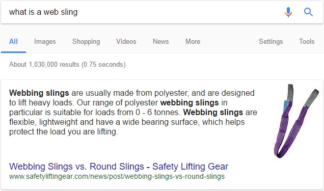
Featured snippet - What is a web sling?

A featured snippet may also include bullet points, a table, or - as shown below - a numbered list.
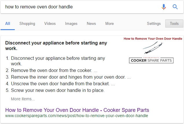
Numbered list snippet - How to remove your oven door handle

If you phrase your Google search in the form of a question (e.g. 'where was lord of the rings filmed' or 'how do antibiotics work'), the top result will very often be a featured snippet. This applies to voice search as well as to traditional text searches - for instance, a Google Home device will usually respond to a question by simply reading out the featured snippet for that keyword phrase.

Google is showing featured snippets for more and more searches as time goes by (we've even started seeing them for non-question queries like 'safety goggles'), and if Google starts displaying your competitor's content in a big box at the top of the SERP, there's a very good chance that your organic traffic will plummet as a result.

For this reason, it may be worth rewriting some of the copy on your site with question-type keywords in mind so as to snag as many of those 'featured answer' spots as possible.

Further reading: How to Gain Featured Snippets

5. Accelerated Mobile Pages (AMP)

AMP (Accelerated Mobile Pages) are Google's solution to the increasingly prevalent expectation that online content should load instantaneously - especially on mobile devices. Website owners can now create 'accelerated' versions of their pages specifically for mobile users, and this is definitely something to bear in mind if you're determined to deliver an outstanding mobile browsing experience.

An accelerated mobile page is essentially a stripped-down version of a normal web page that is specifically designed to load very quickly. AMP pages were originally available only to well-known publications like the Telegraph and the Independent, but the technology is now open to all, which means that you can create lean, fast-loading versions of your key pages in order to please mobile users and (potentially) rank more highly in Google's mobile results.

Using AMP on your wensite will significantly improve the speed with which your website is delivered to users. It may also give you an advantage on the Google AdWords platform to boot.

Does your website need an update or a redesign? Request a FREE quote from the Designer Websites team!

New SunSpaces Website Design

SunSpaces is part of Greensquares, a family of businesses specialising in high-quality, low-maintenance outdoor products. We've already revitalised Greensquares' porcelain tile and composite decking websites this year, and we can now add SunSpaces - the company's contemporary garden room brand - to that list.

Last week saw the relaunch of www.sunspaces.co.uk with a brand new design that we think will help the SunSpaces brand to really make an impact on the increasingly popular garden building market. Large, attractive photographs now dominate each page, and the improved user interface makes it far easier for visitors to browse and compare the various garden rooms, verandas and glass extensions available from the SunSpaces team.

As with PrimaPorcelain and TimberTech (the other Greensquares websites that we have recently redesigned), SunSpaces has also been switched from HTTP to HTTPS - click here to find out more about why we're recommending this to our clients right now.

Need a new look for your company website? Request a FREE web design quote here.

Web design is constantly changing and adapting and as we are now halfway through 2017, we thought we would delve into the world of web design and take a look at the trends which are currently dominating the design sphere. From simplistic to bold, the web design trends of 2017 are certainly something to marvel at. 

Material Design

Whichever part of the web you’re browsing, Material Design is a web design trend that is everywhere in 2017. Developed by Google for Android in 2014, Material Design’s sole purpose is to provide users with a clean and accessible interface. An evolution from Flat Design, Material Design brings some of the usefulness of skeuomorphism (such as layers and depth) back to web design, while still maintaining the simplistic and usable nature of Flat Design.

With its Material Design concept, Google has provided rules for what type of style, layout, pattern, usability a material website or app should contain. These guidelines ensure your website will look both neat and eye-catching at the same time. 

Vibrant Colour Designs

While the past couple of years has seen designers opt for the safer colour pallets, 2017 has watched vibrant colours become a popular web design trend. With the popularity of material design leading to criticism that many websites are beginning to look similar, bright and bold colours are a great way to stand out from the crowd.

Vibrant colours can also freshen up an older website or can be incorporated in small amounts, such as adding a strikingly vibrant image to your website. Bright and bold typography can also be used to add this web design trend to your website without changing the entirety of it.


Minimalism

Minimalism is a concept that has been around for many years, but this year it is becoming one of the most important web design trends. As it can be assumed from the name, minimalism is a web design trend which focuses on minimal elements on the website and removes any unnecessary elements from the design.

In previous years, minimalism has adopted a reputation of simplistic black and white colour schemes, but this year we’ve seen a turn for the best with websites that adopt both the minimalist and vibrant colour web design trends as shown by R magazineFlatsLife is another beautiful example of the black and white nature of traditional minimalism. 


Brutalism

Although not technically a web ‘design’ trend, Brutalism is definitely a web design concept to keep your eye on this year. Known as the antithesis of web design, Brutalist Design aspires to defy all the traditional rules of web design. Some say it is based on the giant concrete buildings built in the 1950s-1970s – designed to do only its job.

To create a brutalist website, the general rule is to not follow any rules. Colour clashes, text which doesn’t fit in the box, gradients, hard to find links – these are all acceptable in brutalist design and some of the biggest names around are using it. Bloomberg, The Outline and Balenciaga are all examples of brutalist design, and the Instagram redesign has been quoted as ‘paving the way’ for brutalist app design.


By looking at just four of the key web design trends this year, it's clear to see that 2017 has brought a variety of different websites to fruition. We predict these web design trends are here to stay and expect to see them once again in 2018. 

Are you looking for a new website design? Our talented team of expert designers and developers can help you with that. Get in touch today to request a free quote.