Part of the ever-expanding Greensquares family, DeckPlus is the newest brand to hit the UK composite decking market.

Offering a wide selection of decking products – ranging from premium, capped composite decking to affordable, eco-friendly hollow deck boards – the company were looking to create a fresh site that reflected this exciting new brand.

After laying down the gauntlet to our web designers, we quickly got to work creating a fresh, new site for his fresh, new brand.


web design, web designers, SEO experts


A One-Stop-Shop

Combining their existing TimberTech products with their all-new DeckPlus branded boards, the desired outcome of the project was conceptualised as an online amalgamation of decking solutions, providing the ultimate one-stop-shop for decking design.

The result was DeckPlus.co.uk – a true home for all things composite decking.

The DeckPlus website provides a welcome online home for the DeckPlus brand, while also acting as a worthy second-home for the company’s TimberTech range, in addition to the pre-existing TimberTech site.


A Modern Site for Modern Products

As part of the brief, we were asked to provide DeckPlus with a site that reflects their modern products.

Our team of expert designers were more than capable of living up to the challenge and were eager to create a site that accurately reflects the new brand’s contemporary flair, while also providing the necessary capabilities of an effective decking site.

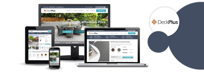
Logically laid out in a prioritised order, each webpage is packed with all the user-friendly functionality you would expect from a professional site, blending helpful information with simple processes and easy navigation.

Topped off with a clean, crisp oceanic colour scheme, the aesthetic appearance of the site is modern yet inherently easy on the eye, with an occasional infusion of orange-brown as a tip of the cap to the company logo.


User-Friendly Functionality

From a functionality standpoint, we created an uncomplicated layout that provides seamless usability on all devices, working just as well on a mobile or tablet as it does on a laptop or desktop.

For further ease of use, the site is specifically designed to allow you to refine your decking search by a variety of chosen criteria: from colour and price to decking type and product range.

What’s more, the simple navigation bar positioned at the top of each page allows you to effortlessly transition from one page to the next, without the hassle or fuss of searching high and low for the relevant tab.

The site also features a company blog page to keep users up to date with all the latest goings-on in the company, as well as the wonderful world of outdoor decking.


Optimised Web Copy

DeckPlus offers a myriad of stunning designs and a variety of decking materials at a range of prices to suit all budgets. As a result, the site houses a vast online catalogue of these products and sub-categories, all requiring unique copy for each and every page.

This necessitated bespoke web copy for the entire site. Each page needed captivating copy that still included the all-important fundamentals: the essential top-line information, supplementing by the detailed nitty-gritty, before rounding off with the bottom line of price.

Meanwhile, each page was also painstakingly optimised by our SEO experts to give the site a running start when it was made live. This has helped to ensure the correct pages rank for the relevant industry terms and product descriptors in the search engine results, ultimately boosting the likelihood of conversions.


For more information on our web design and copywriting services, why not get in touch today? Call now on 01446 339050 or click the button below to get a quote online now.

Get a Quote

Alana Spencer has been a client of ours ever since she won BBC's The Apprentice in 2016 and asked us to design a new website for her handmade cake business, Ridiculously Rich by Alana.

Ridiculously Rich has been going from strength to strength since Lord Sugar invested in the company two years ago, and earlier this week, he and Alana announced their new Cakepreneur initiative, which promises to drive even greater growth as we head into autumn.

Here's an introduction from Alana and Lord Sugar themselves:

Building the new Cakepreneur system

The Designer Websites team have been hard at work over the last couple of weeks, striving to ensure that the website's new Cakepreneur system would be ready for its big launch.

We were asked to build an add-on for Alana's existing Ambassador system to accommodate a new type of reseller: Cakepreneurs. This was conceived as a more affordable way to join the Ridiculously Rich family - it costs £1,000 to become the Ridiculously Rich Ambassador for your region, whereas Cakepreneurs pay a one-off setup fee of just £150.

Cakepreneur Starter Kit

A Ridiculously Rich Cakepreneur starter kit.

Our skilled web developers created a sign-up area that makes it easy for would-be Cakepreneurs to get the ball rolling. Once the user has filled in their details, the website shows them an introductory video, then prompts them to take a quick online test. Those who pass this test can then pay the setup fee and order their starter kit (pictured above).

What do Cakepreneurs do?

Cakepreneurs earn commission by selling Ridiculously Rich cakes to...

  • Cafés
  • Delicatessens
  • Farm shops
  • Corporate clients

...and so on. Each Cakepreneur is given a unique discount code that entitles their customers to 5% off all online orders.

The system that we have designed and developed makes it easy for Alana's Cakepreneurs to sign in and manage everything. Each Cakepreneur can create their own Ridiculously Rich profile, add meetings to their own personal calendar, and sign up clients who will earn them commission with each order placed. The system also allows the Ridiculously Rich administrators to see how active each Cakepreneur is.

Additional development

In addition to the new Cakepreneur system, Designer Websites also built...

  • A new downloads section that allows Ridiculously Rich to share documents, videos, and other downloadable resources with their Ambassadors and Cakepreneurs all over the country.

  • 'Stockists' page (view here) that makes it easy for users to find nearby shops that sell Ridiculously Rich cakes.

  • A new 'Find My Nearest' page (view here) - simply enter your postcode to see a full list of Ridiculously Rich Ambassadors and Cakepreneurs in your area.

Alana explains why she chose to work with Designer Websites

Visit Ridiculously Rich > Get a Web Design Quote >

Bespoke Online Solutions

Truly successful online businesses don't just need a website that's user-friendly and optimised for search engines. More often than not, they need specialised functionality, a significant level of automation, comprehensive administration portals, integration with other business solutions...the list is long, and of course, every business has its own specific requirements.

In this post, we'd like to show you 10 quick and simple examples of the bespoke online solutions that we've created and implemented for our clients.

More...

Online Booking Systems

Here at Designer Websites, we've created online booking systems for a wide variety of clients. Examples of the solutions we've developed include:

💊 Appointment booking systems for health clinics 
🔧 Boiler installation booking systems for plumbers / heating engineers 
😊 Visitor booking systems for leisure centres
⛷️ Equipment booking systems for ski holiday providers
⚖️ Consultation booking systems for legal practitioners

With all of these projects and more under our belt, we have a very strong understanding of what makes a good online booking system. Here are the five things that we consider to be most important:

A smooth, speedy user interface

Like any online application, an e-booking system should make the user's experience as pleasant and as painless as possible by loading quickly and functioning flawlessly. Your customers don't want to sit around twiddling their thumbs as they wait for a list of available timeslots to appear; nor will they enjoy trying to work out what to do next when your date selector doesn't load properly and the day they want to book isn't visible. Aim to get both your booking system and your website as a whole operating smoothly, with no glitches, no hiccups, and minimal load times.

A user-friendly date selection system

Make it as easy as possible for users to identify and select their preferred date and time. Many online booking systems utilise a month-by-month calendar layout, which is great because it's a format with which most people are familiar. However, whether you use the calendar style or not, you need to ensure that your customers can easily specify:
  • Their preferred date (or date range if, for instance, they're booking a holiday)

  • Their preferred time (if applicable)

  • The duration of their appointment

  • The type of appointment they're booking (if you offer a range of different services)
If users find it difficult to make these selections, they may well abandon your website and take their business elsewhere.

A clear breakdown of charges

Before asking for any payment details, you should provide each user with a cost summary that clarifies:
  • How much is owed
  • When this amount must be paid
In some cases, the full amount will need to be paid up front in order to confirm the booking; in other cases, the user may have to put down a deposit or booking fee to reserve their timeslot, with the remainder of the cost to be paid in person on the day of the appointment. Some hotels take credit card details upon reservation, but do not collect any money at all until check-in. However you have chosen to do it, it's important to make things crystal-clear to each customer before asking them to enter their payment information.

A simple and secure payment system

When your booking system includes an online payment step, the rules are just the same as on an ecommerce website: make the payment process as straightforward and as secure as possible. Consider using a popular online payment system like PayPal, as this will allow many of your customers to simply enter an email address and password instead of typing in their entire credit card number. Don't demand any personal information that you don't actually need - the longer the form, the more likely that a customer will give up before completing it. And, most importantly of all, make ABSOLUTELY sure that all payments are processed securely (under HTTPS rather than HTTP).

A detailed confirmation email

Once a customer has completed a booking on your website, you should immediately dispatch a confirmation email containing all the key details of their appointment (e.g. date, time, location, outstanding costs that you're expecting them to settle on the day). You should also endeavour to make it nice and easy to change appointment details in the event of an error; for example, if somebody requested a 2pm appointment when they actually wanted a 4pm appointment, you now need to give them an easy way of correcting their booking, whether by contacting a member of your team or by manually editing their appointment details online.

So, what makes a good online booking system? In short: clarity, simplicity, efficiency, and ease of use. If your business needs a new website with a fully-integrated online booking system, get in touch with Designer Websites now to request a quotation!

Travel Booker System

Travel Booker is a UK-based company that sells ski holiday packages. The Travel Booker team have specialist knowledge of Andorra and its many popular ski locations, and they provide holidays to Arinsal, Soldeu, and several other resorts.

There are lots of different things to consider when organising a ski holiday in a foreign country. In addition to making hotel reservations and travel arrangements, skiing and snowboarding enthusiasts may also wish to book:
  • Lift passes
  • Professional ski lessons
  • Rental equipment (e.g. skis, boots, helmets, snowboards)
  • Transfers between the airport and the resort itself
Instead of leaving their customers to sort all of this out alone, Travel Booker wanted to offer an easy way to take care of all the bits and pieces online. To achieve this, they got in touch with the team here at Designer Websites.

Our experienced web developers constructed a sleek, user-friendly booking system that's perfectly tailored to the needs of Travel Booker's customers. This system has been incorporated into a number of websites owned by Travel Booker, so no matter which resort you're planning to visit, you can take care of all your extras with ease. Since the booking system has a responsive design (created by our expert web designers), you can even take care of everything on your smartphone or tablet - the user interface works equally well on all screen sizes!

Click here to visit one of Travel Booker's websites and see their new booking system for yourself. Alternatively, if you've got a web development project that you'd like to discuss with the Designer Websites team, get in touch now - no matter how complex your requirements, we're always excited to take on new projects!