Alana Spencer has been a client of ours ever since she won BBC's The Apprentice in 2016 and asked us to design a new website for her handmade cake business, Ridiculously Rich by Alana.
Ridiculously Rich has been going from strength to strength since Lord Sugar invested in the company two years ago, and earlier this week, he and Alana announced their new Cakepreneur initiative, which promises to drive even greater growth as we head into autumn.
Here's an introduction from Alana and Lord Sugar themselves:
Building the new Cakepreneur system
The Designer Websites team have been hard at work over the last couple of weeks, striving to ensure that the website's new Cakepreneur system would be ready for its big launch.
We were asked to build an add-on for Alana's existing Ambassador system to accommodate a new type of reseller: Cakepreneurs. This was conceived as a more affordable way to join the Ridiculously Rich family - it costs £1,000 to become the Ridiculously Rich Ambassador for your region, whereas Cakepreneurs pay a one-off setup fee of just £150.

A Ridiculously Rich Cakepreneur starter kit.
Our skilled web developers created a sign-up area that makes it easy for would-be Cakepreneurs to get the ball rolling. Once the user has filled in their details, the website shows them an introductory video, then prompts them to take a quick online test. Those who pass this test can then pay the setup fee and order their starter kit (pictured above).
What do Cakepreneurs do?
Cakepreneurs earn commission by selling Ridiculously Rich cakes to...
- Cafés
- Delicatessens
- Farm shops
- Corporate clients
...and so on. Each Cakepreneur is given a unique discount code that entitles their customers to 5% off all online orders.
The system that we have designed and developed makes it easy for Alana's Cakepreneurs to sign in and manage everything. Each Cakepreneur can create their own Ridiculously Rich profile, add meetings to their own personal calendar, and sign up clients who will earn them commission with each order placed. The system also allows the Ridiculously Rich administrators to see how active each Cakepreneur is.
Additional development
In addition to the new Cakepreneur system, Designer Websites also built...
- A new downloads section that allows Ridiculously Rich to share documents, videos, and other downloadable resources with their Ambassadors and Cakepreneurs all over the country.
- A 'Stockists' page (view here) that makes it easy for users to find nearby shops that sell Ridiculously Rich cakes.
- A new 'Find My Nearest' page (view here) - simply enter your postcode to see a full list of Ridiculously Rich Ambassadors and Cakepreneurs in your area.
Alana explains why she chose to work with Designer Websites
Visit Ridiculously Rich > Get a Web Design Quote >
.jpg)
Robert D. Johnson Funeral Directors are an independent funeral service based in Barry, Vale of Glamorgan. This family-run business specialises in bespoke, flexible funeral services for families who are looking to make arrangements after the passing of a loved one. With extensive experience in funeral care, they ensure every family receives the service they’ve envisioned for their dearly departed – while alleviating them of the stress of organising the funeral arrangements during their period of grief.
Robert D. Johnson Funeral Directors offer the following funeral packages:
As an independent business, Robert D. Johnson offer a caring, personal service that large chains are sometimes unable to provide. Staff are selected on the basis of their professionalism and caring approach to their work.
How Did We Help Them?
We have created a user-friendly brochure website for Robert D. Johnson Funeral Directors. The new design is professional and befitting of the industry in which this client operates, and the website interface is very easy for users to navigate. Visit www.rjfunerals.co.uk to take a look at our work.
We provided:
- Responsive Website Design – The RJ Funerals website functions well across all screen sizes whilst maintaining its sophisticated look. Regardless of the device used to access the website, the pages of the website maintain their look and ease of navigation.
- Search Engine Optimisation – Every page on the new RJ Funerals website features high-quality content which is relevant to the user, effective in communicating the services offered, and carefully optimised for high Google rankings.
Do you need a bespoke, professional website to showcase your business and the services you offer? If so, get in touch with Designer Websites for a free, no-obligation quote.
Get a Web Design Quote >

What’s happening?
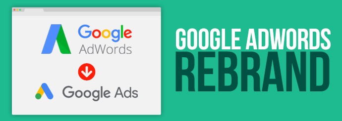
Google are officially rebranding Google AdWords – it’s been a long time in the coming, and after more than 17 years, Google are consolidating their Ad products to fall under one umbrella name & service. Henceforth, Google Ads will be the catch-all title for the vast majority of Google’s Ad tools. Other related products will fall into the categories of Google Marketing Platform and Google Ad Manager.
Why?
After nearly 20 years of AdWords, what has triggered this rebrand, I hear you ask? Well, to answer that question we have to consider a few different strands. The official word from Google has come mostly in the form of comments from Sridhar Ramaswamy – Vice President of Ads & Commerce at Google.
Ramaswamy stated that the rebrand is at least partially a response to “consistent feedback” that the duplicity of Ad products offered by Google can lead to a confusing experience for the user.
Many have also predicted that the removal of the term ‘word’ from the brand name indicates an incoming departure from keyword driven advertising. Ramaswamy himself has been quoted saying the brand change “is indicative of where we have been directing the product” – but exactly how this new direction will play out remains to be seen.
When?
The AdWord rebrand was first announced at the end of June, but the official changeover is scheduled to take full effect on 24/07/18. From this point on, all users who wish to continue using AdWords will have to do so using the rebranded Google Ads platform.
Out with the old, in with the new
At a glance, we’ve considered some of the pros & cons of the new Google Ads interface.
Listed below are some of the ostensible & more significant differences produced by the rebrand:
- Pro: advancement in reporting style – in the new Google Ads interface there is a greater level of detail afforded to the way data is displayed; including the ability to create graphs to visually display data from Ads.
- Con: The major change in layout has meant those familiar with AdWords have had to learn how to navigate the new layout to find what they’re looking for; the new look is akin to the dashboard style used across other Google services. For the time being this change is making things a little frustrating for marketers.
- Pro: Showcase Ads – this new Ad product allows advertisers to display a group of products (rather than just one) along with a small amount of text so that brands can more comprehensively introduce their business to a new prospect.
- Con: Columns in the new Ad interface have been reset meaning specified information is no longer displayed when accessing Google Ads – the upshot of this is more time is spent seeking out information, when you could already be processing it.
- Pro: Promotion extensions – this new feature gives advertisers the ability to show and link to specific offers within Ad text. This new addition should result in far greater click through rates, which is always music to marketers’ ears…
The bottom line
As with anything new, Google Ads has been met with a certain amount of reluctance; infamously, people don’t tend to like change, but we’re sure that brands and businesses will begin to adapt to the features of Google’s Ad rebrand – just as Google’s Ad products will continue to evolve based on feedback from users.

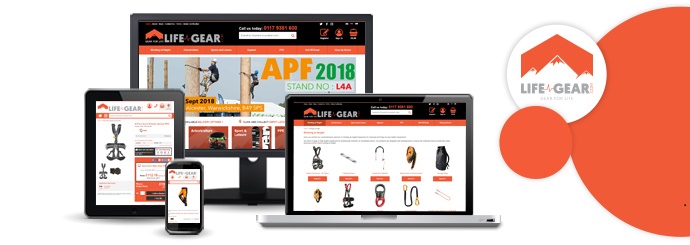
We recently finished work on a brand new ecommerce website called Life-Gear.com. This site is home to a huge variety of different products, including:
- Climbing equipment
- Protective clothing
- Festival gear
- Off-road essentials
The website itself has a user-friendly design that adapts to the screen it's viewed on, allowing adventurers of all stripes to make purchases on the go using their smartphones. In addition to the secure online checkout system, this site includes the option to pay in three different currencies (pounds, euros and Emirati dirhams), enabling the company to sell their products to a huge international market.
Visit Life-Gear.com now to browse the website for yourself, or click here to request a quotation for your own ecommerce web design project.

With clinics located in Barry, Canton and Whitchurch, and physiotherapists boasting BSc (Hons) degrees, postgraduate training and Chartered Society of Physiotherapists / Health Professional Council accreditation, David Bolwell Physiotherapy Services is one of the top physio clinics in South Wales. They possess extensive experience and provide treatments dealing with muscle, soft tissue and joint conditions, as well as post-surgery rehabilitation and sports injuries.
Here are some of the conditions that David Bolwell Physiotherapy Services treat:
- Neck & Back Pain
- Overuse Injuries
- Muscle & Ligament Injuries
- Osteoarthritis
These conditions are treated in various ways, including:
- Massage
- Acupuncture
- Acupressure
- Mobilisation & Manipulation
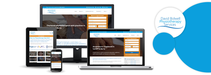
DB Physio Services asked us to give their old brochure website an enhanced look and feel, paying particular attention to the website’s usability on a number of devices and the ability to send enquiries with ease. We’re proud to announce that DB Physio’s new and updated website is now live – visit https://www.dbphysio.co.uk/ to see the new design.
What Have We Done?
In order to improve on the company’s existing site, we focused on a number of improvements:
- Responsive Design – A key aim of the new website was to allow users on varying devices with different screen sizes to experience the same great design. The new DB Physio website now possesses a fully responsive design that works well and looks great on any device.
- SEO – The need for high-quality content is imperative for any brochure website. We optimised each page of the new website and helped DB Physio to create information, high-quality content in order to rank highly on search engines like Google.
- Enhanced User Interface – The new DB Physio website allows the user to make a swift and detailed treatment enquiry. The updated enquiry form contains that ability to select the user’s preferred clinic and appointment date/time.
If you are in need of a professional-looking website for your business, please do not hesitate to get in touch with the team at Designer Websites. Request a FREE, no-obligation quote for your project here.
