Here at Designer Websites, we have worked with clients from a huge range of industries to build websites that sell baked goods, birdseed, lifting equipment, ladders and more... With all this web design experience under our belt, we can confidently say that targeted website design is a vital part of building a successful site for any client.
Today we're going to take a look at what ‘targeted website design’ means and show you how you can implement it, so that your website attracts the right kinds of people who’ll convert time and time again.
What does targeted website design mean?
When our clients initially approach us, they often want to create a website that will appeal to everyone under the sun. That's because they believe that the more people they can entice, the more sales they'll make. But in most cases, this simply isn't the case. As much as you'd like to please everyone, there will be lots of people who simply aren't relevant or interested in the products/services that you offer - and that's okay.
In our experience, the secret to designing a good website that will generate a lot of conversions for your business is to build it with your target audience in mind! That means you need to get to know your existing and potential customers. That way, you can build a website that appeals to them, works for them and inevitably encourages them to buy/enquire!
How to profile your target audience
Before you can get started on your new website, you need to understand everything about your target audience. Essentially, find out what makes them tick. To do this, you should review previous sales, look closely at your existing client base and take note of the people that engage with you on social media. Here are a few things you should be trying to identify:
- How old are they?
- Are they male or female?
- Do they have particular interests?
- Do they have certain careers?
- Are they in a specific region?
By gathering as much information as you can about your target audience, you can start to make web design decisions that work for your demographics. Not only will this help with your website design, but it will also help you to grow your social media accounts and attract relevant people using other marketing strategies.
Read More: Should Facebook Advertising Be Part of Your Marketing Strategy?
Colours and images
The colours and images you use on your website can greatly impact the type of people it attracts. You should use colours that are reflective of your business and the products/services that you offer.
Think about the McDonald's logo for example. The golden arches on a red background are easily recognisable and instantly make you think of delicious, golden fast food. Therefore, their logo is perfect for attracting fast food lovers. Do you think the logo would have the same impact if it was purple and brown?
Your logo and your website form a large part of your business's identity, so it's important that you get it right and appeal to the right kind of people if you want your website to be a success.
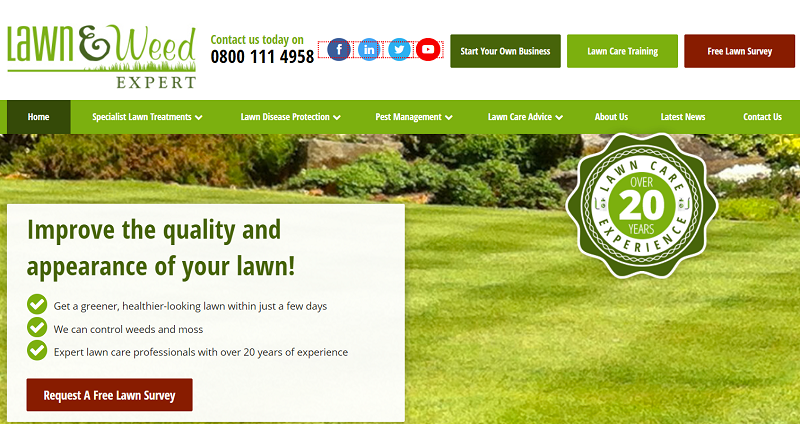
Here you can see a website that we created for one of our clients, Lawn and Weed Expert, that specialise in lawn and garden services:

Their target audience includes people who have a garden and/or are interested in gardening, so it makes sense that their website heavily features the colour green and photographs of beautiful lawns/shrubs.
We chose the deep red colour for the call-to-action buttons because red and green are opposite colours. This means the red accents really pop against the green, and show users exactly where they can access important services, like a free lawn survey.
Website copy
The wording on your website should entice the right users, but most importantly, should be easy for them to digest. Think about who is visiting your site and why then tailor your website copy to fulfil their expectations and show your products/services in their best light.
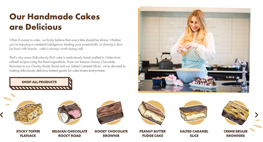
A few years ago, we created a website for Alana at Ridiculously Rich, (a company that specialises in handmade cakes). The Ridiculously Rich customers are all cake-lovers, so the website copy was written to appeal to them.

By using terms like 'divine', 'indulgence' and 'finest ingredients' Ridiculously Rich emphasises how delicious and luxurious their baked goods are, making you want to take a bite right away. (You can practically taste the gooey chocolate brownies on your tongue, can't you?)
You can also see how photographs can be used to complement your website copy and further enhance the message you're trying to portray to your target audience. Alana is photographed baking (what appears to be a delicious rocky road), which emphasises that all of the Ridiculously Rich cakes have a homemade quality & are baked with love. If that doesn't make you want to buy them, I don't know what will.
Evolving your website over time
Targeted website design shouldn't end when your new website goes live. In fact, we strongly believe that your online presence and brand should constantly evolve with your business. As the years go by, you'll get a much better understanding of your client base, and you might find that testing new images, new copy and new colour schemes can help improve your website conversions.
Read More: Category Page Design - How to Improve Your Category Pages
Remember, something that worked for your target audience over the last 5 or 10 years might not be so effective now. People and their tastes change over time, so don't be afraid to try new things. If you're ready to give your business a fresh new look, contact us for a FREE web design quote now!
Contact Us >