Design trends shape how web designers decide to carve out your brand identity, and this has an impact on how users interact with your website and your business.
We're only seven months into 2022, yet this year has already seen an array of fresh design trends rippling through the website design industry. We've hand-picked a few to discuss their effect, their impact, and why we think they're among the most significant website design trends of 2022 so far.
1. Bold and Experimental Typography
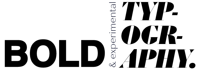
In 2022, it's been made clear that there is no wrong way to do typography. Many designers have started to think outside the box and ask: what else can typography convey?
The possibilities are endless. Designers have opened up a new avenue of creativity in considering how typefaces can maximise impact for website users. You can build up your typography as much or as little as you like, too; by utilising elements such as animations and flex options, designers can easily channel authenticity and uniqueness in regard to your brand and your website.
Using large and oversized type has proven to be an extremely popular 2022 web design trend. Due to this, words become integral graphical elements within a website's design. Additionally, websites are using less imagery and making up for it in bold, oversized typography - placing words at the forefront.
2. Pantone's Colour of the Year: Very Peri
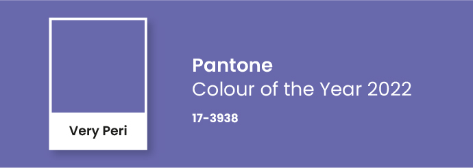
Since 2000, Pantone has selected a colour of the year and shared their annual choice with the public. Over the years, the chosen colour has increased in significance and influence - in particular, Pantone's chosen colour makes huge waves in the design world each year, impacting the colour and branding of products and even whole industries!
The chosen colour aims to represent where humankind stands in the current year. As a kickstarter for 2022 web design trends, Pantone selected the shade 'Very Peri': a blend of purple, blue and red, inspired in part by the metaverse. Here's what Pantone had to say about their colour selection:
"As we move into a world of unprecedented change, the selection of PANTONE 17-3938 Very Peri brings a novel perspective and vision of the trusted and beloved blue colour family, encompassing the qualities of the blues, yet at the same time with its violet red undertone, PANTONE 17-3938 displays a spritely, joyous attitude and dynamic presence that encourages creativity and imaginative expressions."
Inevitably, Pantone's Colour of 2022 will remain high on the list of 2022 web design trends. It's the embodiment of the whole year, so expect to see a lot more of Very Peri!
3. Art Deco, Geometrics and Minimalism
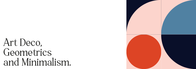
This trend comes as a 3-in-1! So let's dive into the different aspects and what they convey when they're combined...
Features of art deco include intricate line art, rectilinear geometry, layered shapes and symmetry. It is for this reason that geometrics and the minimalism movement aid and compliment the art deco genre. Linework can be used to create and outline sections, headers and paragraphs, making it easy for your target audience to obtain relevant information about your business.
In a world where everything seems a bit unfamiliar at the moment, structure and stability is what we are all craving in between everyday interactions. Art deco design can give this to a web user, through the use of representational linework and patterns, alluding to order and formation.
4. Collage Illustration
By using the correct imagery, designers can easily portray positivity and optimism. One way to do this is through collage illustration. This is a form of visual art in which visual elements are combined to create an entirely new image that conveys a message, or an idea.
Collage illustrations can include lighter typefaces, eccentric fonts and welcoming colours - all of these can be combined to define the over-arching 'feel' of a website. This is integral, as this will impact your target audience's first perception of your brand.
You may even be able to combine elements and representations of what you want your brand to be into a single image, to give people a quick snapshot of your brand persona.
5. Interactive Typefaces
Through using a hover state, it is possible for text on a website to move alongside or with your cursor. Adding an interactive typeface to your website can create a more engaging experience for the website user. It's entertaining, it's addictive, and it might just keep the user on your site for longer.
Interactive typefaces can also alter the user's perception of your page's loading time. The web user is much less likely to notice a long loading time if they can play around with the font for a bit!
This trend brings UX and design together to benefit the needs of your target web user.
And there we have it! The top website design trends of 2022! Trends come and go, but the effects of them stay with the web user. In a few months, weeks, or maybe even tomorrow - there will probably be new top web design trends to jump on! We can only wonder what they will be...
Need more web design advice? Get in touch!